


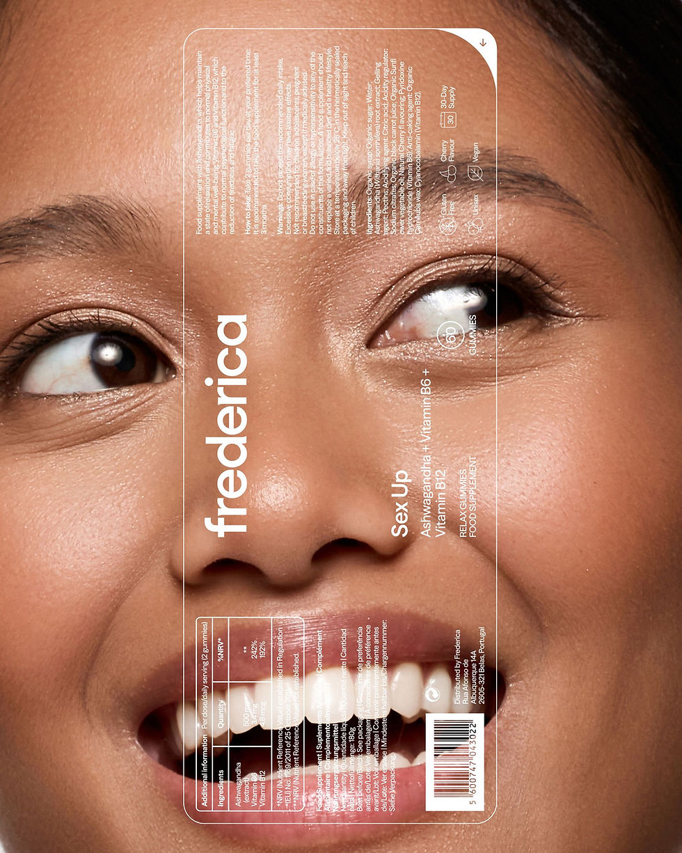
The new packaging brings these elements together in a clearer and more informative way. The brand, ingredients and benefits of each product are given more prominence, making the information easier to find and understand while reinforcing a more transparent relationship with the consumer.
This informative approach is balanced by the use of colour combinations across the different product ranges. The interplay between colour, typography and content creates a packaging system that feels fresh and playful, while maintaining the clarity and seriousness expected from a functional supplement brand.
The same visual language extends across posters and social media, where colour, photography and typography are used to create a more dynamic and engaging presence. Photography puts the products and the experience of using them at the centre, while the new logo and colour palette add more impact to the communication.
On social media, the photographic approach is complemented by infographics and visual references from scientific research. These elements give the brand space to share useful information and explain more complex subjects in a clear and accessible way, introducing a more informative dimension to the communication of the brand.
Together, these elements create a contemporary and vibrant visual language that balances information and expression, allowing Frederica to communicate with confidence while remaining accessible and relevant to everyday life.


Colour and typography help bring Frederica’s new identity together, balancing a more confident visual presence with the feminine character of the brand. The new colour palette builds on the tones already used across the different product ranges, introducing fresher and more vibrant combinations. The colours give each range its own identity while creating a more energetic and contemporary look across the brand.
The typographic system combines a serif and a sans serif typeface. Their contrast creates hierarchy and variation across different applications, while balancing a more structured and scientific feel with softer, more feminine details.


The new identity gives Frederica a stronger and more distinctive presence, while keeping the brand approachable and easy to understand. Rather than presenting wellbeing as something aspirational or complicated, Frederica becomes a brand that embraces it as a personal, enjoyable and accessible part of who we are.
This rebrand celebrates the strength and beauty of individuality, creating a deeper connection between femininity, science and wellbeing, and positioning Frederica as a brand that makes feeling good part of everyday life.



YEAR:
TYPE:
DESIGNED AT:
DESIGNED WITH:
PHOTOGRAPHY:
2025
BRANDING & PACKAGING
LOVE STREET STUDIO
CARMO MINEIRO & JOANA RANGEL
Ana Araújo Silva (Indigo Studio), Juliana Magrin & Tânia Dioespirro
Frederica
Frederica is a women-led supplement brand that makes self-care simple, enjoyable and easy to fit into everyday life. Its products are designed for women who want to feel good and take better care of themselves, from the inside out.
The rebrand brings Frederica’s personality forward with a bolder and more distinctive identity, while keeping its feminine character. The new visual language builds on the brand’s credibility and knowledge, but presents them in a more approachable and contemporary way — confident, clear and easy to connect with.


As Frederica evolved, its visual identity needed to evolve with it. The new identity moves away from the more delicate and decorative original wordmark towards a system with more presence and flexibility, while keeping the character of the brand.
The new wordmark reflects a woman who feels complete and invests in becoming the best version of herself, using a grotesque typeface to give Frederica a more confident and contemporary feel. Small serif details add a softer and more feminine touch, bringing together the brand’s scientific and feminine sides in a simple and balanced way.
A complementary symbol was also created as a flexible graphic element for print and digital applications. Based on an abstract version of the letter F and built from a circle, it represents wholeness and a more holistic approach to wellbeing.